
Creating visual description commentary for a work of art is not an easy task as it is. Open any guide for visual description specialists, look up any academic website or just enter “visual description” or “audio description” in the search box, and you will find that no more than 5 to 10 per cent of the results you get pertain to the issue of audiovisual translation of art.
And most of the material you find will be dedicated to describing representational art, whereas any person who has been to a museum of contemporary art has probably noticed (maybe even in his or her own experience) that abstract works, as a rule, cause quite controversial feelings in the audience.
Speaking about sightless or partially sighted visitors, researchers cannot come to a single opinion: materials that state that blind and visually challenged visitors study abstract pieces with great enthusiasm (because they do not require recognizing and are highly unusual, unique, amazing) are equally numerous as those that insist on a directly opposite view that representative art is far more relatable for visually impaired persons, because it tells a definite story that can be compared with life.
For five years I’ve been conducting guided tours in contemporary art museums and I have rarely met sightless guests who prefer abstract art (here we find no big difference from sighted audience).
It is a common case, but of course, not every visually challenged person can be thus described.
Even when giving commentary about representative art, a visual description specialist faces numerous questions, many of them being of a philosophical nature: first and foremost, these are questions concerning the language of the description, its expressive overtones, the permissibility of subjective opinions in such descriptions.
At the same time, while describing abstract art these questions become especially pressing. In my opinion, the answers wholly depend on the goal of the visual description commentary: where, when and in what kind of context it will be presented. How much time can we spend describing the work of art? Will sightless persons have the opportunity to study a model of this work or the work itself?
The shorter the time and the fewer additional aids the sightless audience will have, the more expressive and graphic should be the description in order to create an image of maximum vividness in the mind of the viewers in these unfavorable conditions of strict economy of resources.
The Way To Describe Works Of Art
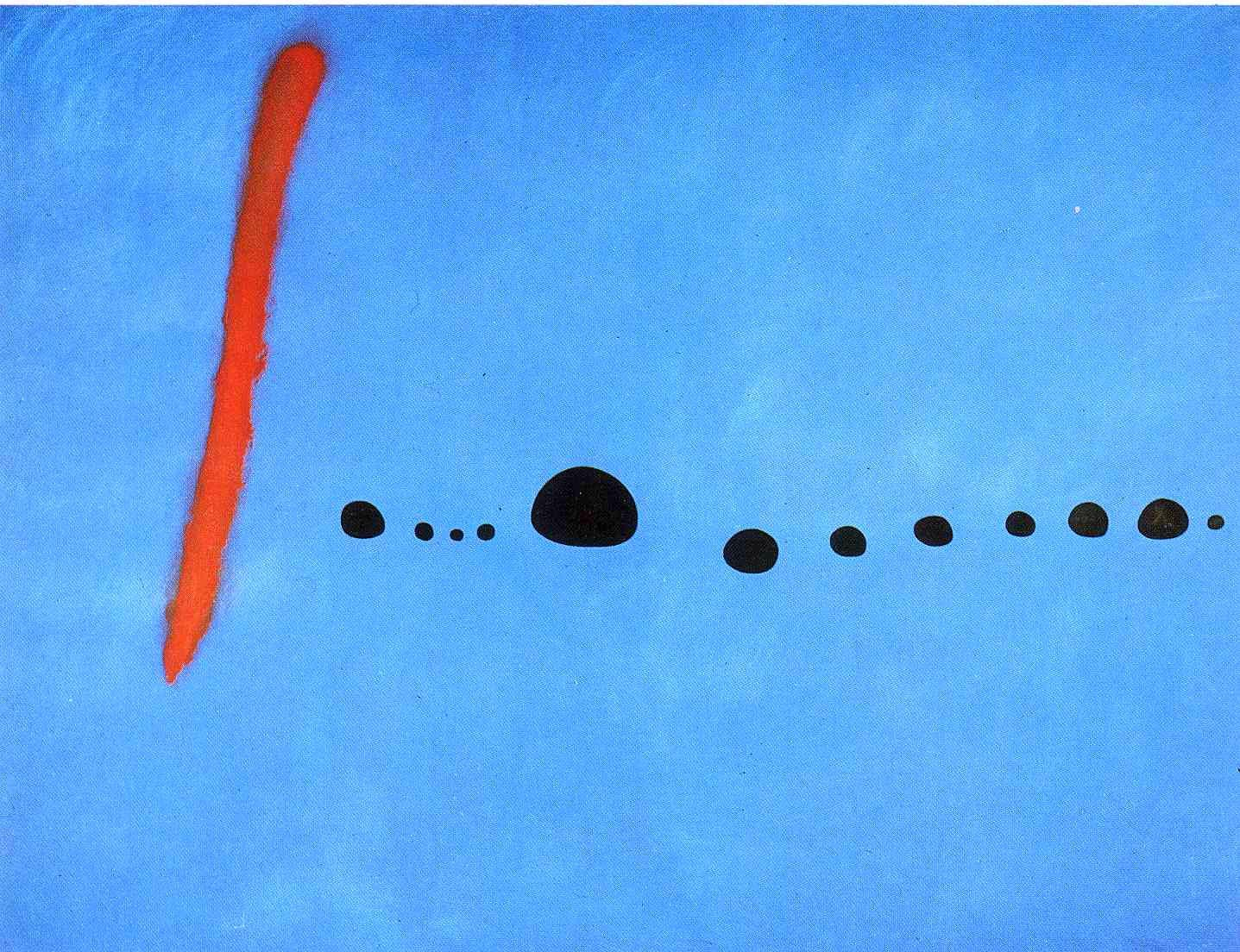
Let us take as an example a painting by Joan Miró Bleu II which will be rather easy to describe.
Description of an abstract piece does not differ from that of any other work of art. The same algorithm may be found in materials by the most esteemed Joel Snyder (a well-known visual description expert) , and in Art Beyond Sightorganization recommendations, and also in most manual guides on the subject. It may be compressed into the following essential points.
- General Data
Orientation inside the museum room (if it is important for understanding the concept of the exhibition as a whole), artistic media (painting, sculpture, photography, etc.), canvas orientation (vertical or horizontal).
Example:
-
Stylistics
Here we often encounter two major mistakes. The first one is that quite frequently this part of description is simply omitted. But let’s be frank, if you hear a description like: “A group of naked people dancing in a green field against dark-blue sky”, it is doubtful that the first thing you imagine will be La Danseby Henri Matisse.
To my mind, while making a visual description it is crucial to avoid “the sudden appearance” effect (see next point). Such an effect may be observed when a person has already created a certain image, but in the end you tell him or her something (like the fact that the work is painted in a certain style or manner) that destroys the image. That is why it is so important to describe the style in the very beginning.
Another mistake connected with stylistics is using special terms.
If you are working in close collaboration with museum employees or art experts, most likely you will have to fight special terminology. While the word “abstract” is universal and is usually understood by general public (although in this case, too, it’s better to clarify what you actually mean), terms like “suprematism”, “cubism”, “rayonnism” and so on need detailed explanation. It is crucial to know the optimum length of your commentary. Maybe it will be better to get rid of terms at all and let the audience focus on recreating the image of the work itself without wasting time to remember unfamiliar words.
- The Description Itself
Move from the general to the specific. As stated above, it is important to avoid “the sudden appearance” effect, that is why first of all, one needs to create a general impression of the work.
It is essential to:-
give an impression of the artist’s colour palette (light, bright, intense, dark, pale, which colours are dominant),
-
in one or two sentences create a general conception of the image: what is depicted, where the objects are placed on canvas and in reference to one another.
Example:
Abstract painting. The colours are bright, contrasting, light blue is dominant.
On the left, one vertical red line is painted against light blue background, to the right from it there is a horizontal line made up by small uneven black circles. The blue background fills most of the canvas, the red line and the circles are placed loosely.
After this, you may go into details. While dwelling on details you should choose your system of coordinates and follow it, clearly and laconically defining where the fragments are placed in reference to one another (moving from left to right, from up to down, from the center to the edges, from the main object to secondary ones), but never jumping chaotically from one element to another.
Example:
The red vertical line is placed in the left third of the painting, closer to its left upper corner. It is a little tilted to the right. The line is thick, careless, as if drawn with one confident movement of a thick brush. The edges of the line are blurred. Its colour is vivid, red with a tint of orange.
To the right of the line several black roughly circular spots are painted. Together they form a dotted horizontal line from the red stroke to the right edge of the painting. This horizontal line divides the painting into two equal parts. It is not perfectly straight, forming a slight, barely noticeable wave. The form of the black blobs is irregular. They resemble small stones like sea pebbles put together in a line. All the spots vary in size, some of them are tiny. They are spaced loosely, at a distance from one another. In contrast to the the red line, the black spots are painted very firmly and carefully.
The light blue background, as well as the red line, is painted a little bit casually, with a thick brush. In some places the paint is smeared thick and the colour seems more intense, in other fragments the layer is thin, and there the background looks lighter.
-
- Conclusions
Ideally, the description of the work of art should be unbiased so that a sightless person may form a clear conception of it. Based on such conception, the person will be able to develop his or her own subjective opinion of the work of art. However, this is not always possible in actuality. Whatever one may say, art is a tricky, many-layered thing and unfortunately it may not be brought down to a simple inventory of what is depicted. That is why in the end of the description you may point out some effects, impressions, peculiarities of the artist’s technique that distinguish a work of art from, say, a photo in your ID. In this case, it is important not to take it too far and not to make an objective description into a propaganda of your own likes or dislikes. It is essential to share an impression of the manner of painting: precise or sloppy, with big or small strokes, simplified, reminding of a child’s drawing and so on (compare Malevich’s sharp-edged forms with the same rectangles painted by Rotko). If, as in our example, the composition is not overloaded with details, such remarks may be inserted into the very description of the elements.
Example:
Expansive free space of the blue background and the calm rhythm of the black dots may create a feeling of balance, emptiness, tranquility. Uneven filling of the background resembling water surface or blue sky, and natural forms of the black dots also can bring such associations to the viewer’s mind.
Difficulties One Faces While Describing Abstract Works, And Ways to Overcome Them

Audio description: an abstract painting. Chaotic yellow, red, blue and purple spots overlap one another like waves in a storm. Areas of white space are mixed into this tornado of colours making them even more vivid. Among rounded and smooth forms there suddenly appear sharp-edged elements and separate black lines. They fly away in all directions or clash together with criss-crossed strokes.
- Complicated And Multifigured Composition
Some abstract pieces abound in details. With no distinct story or semantic focus in the painting, all of them seem to be equally important. Moreover, composition is one of the major aspects of abstract works, and as a result, one may feel an urge to minutely describe relative position of all the objects.
Although static nature of most works of art seems to give us an opportunity to dwell on each element, but overly detailed description of abstract pieces tends to turn into something shapeless, that cannot be recreated by a person’s imagination.
For example, many paintings by Kandinsky teem with small abstract forms, intricate lines and transitions of colour, so the best we can do in this situation is try and capture the general composition, balance or disbalance of its parts, a feeling of chaos or order. In Malevich’s paintings, for instance, groups of similar objects often seem to be stringed together along the diagonals of the work. Usually one of the parts of the composition has more of them and it seems to outweigh the other part. In works by Mondrian, and also in some pieces by Miró there is a rigid grid, while in Kandinsky’s paintings the focus is on the relation of the center to periphery.
If we exaggerate our example, we could have gotten down to listing the number, form and size of every black spot, but then in the end we would have forgotten all about the red line and the light blue background.
-
Unusual Forms, Absence Of Real, Familiar Everyday Objects
While with Malevich’s works it is usually rather simple: circles, squares, lines, crosses (such forms must be understood even by an elementary school pupil), often in paintings by other abstract artists there are irregular shapes, amorphous blobs, etc. In such situations the form of these elements may be compared to some everyday object a sightless person is likely to be familiar with (in our example we compared the black spots to sea pebbles). However, one should avoid analogies with objects that are commonly known but cannot be perceived by touch. A simple example is a water drop. Of course, most sightless people probably are able to imagine the form of a drop, but we can’t guarantee that. On the other hand, the form of a seed or a tree leaf is likely to be familiar to them from their own experience. While choosing an analogy remember that it should match the spirit of the work. If the piece is expressly severe and high-flown and you choose some awkward home appliance as an analogy, the impression one will get of the work will be distorted.
-
The Importance Of The Colour Scheme
I would also like to draw special attention to the terminology describing colours. Very often one is tempted to use such fine and serious words as ocher or maroon, but often even sighted people don’t know what these shades really look like, that is why it is preferable to use simple and understandable adjectives (yellow, blue, light blue, etc.). Some working visual description specialists note that such wording may seem poor, especially to those people who have lost their eyesight in adulthood. To solve this problem you may add more specific words to the simpler ones. Example: “A yellowish-brown, ocher object”.
-
Unusual Optic Effects
Images in abstract art may multiply, double, fade out, etc. To explain such effects you may use analogies and metaphors characteristic for other sensory organs. For example, while describing a painting by Marcel Duchamp, Nude Descending a Staircase, authors from Art Beyond Sight organization compared the image to multiple overlaying sounds of a person descending a staircase. In another description the same effect was compared to an echo.
The major danger a visual description specialist faces while interpreting any work of art is getting excessively subjective and making a description confusing. Read your description to several sighted people and show them the original artwork. Read your description to blind experts.
Regrettably, as any translation, visual description is like a photocopy where each subsequent print looses something in comparison with the original, and the image created in the mind of a sightless person may significantly differ from the original. The only way to minimize such distortion is to provide as many reference points as possible, and the visual description commentary should be just the first link in this chain. The more opportunities a person has to get acquainted with a work of art through different media (a tactile model, additional audible data, etc.), the higher the chances that he or she will form an adequate image of the piece in his or her mind.
For your inspiration, I recommend to listen to visual description commentaries in English made by Art Beyond Sight organization.
Joan Miró. The second painting of the Bleutriptych. Oil, canvas.
The painting is a huge rectangular horizontal canvas. The height of the work is half as big as average human height, namely 2 m 70 cm, its width is 3 m 55 cm.